Website Navigation: Types, Trends, and Best Practices
Building a website requires technical know-how and an eye for design. Whether you own a business with five employees or 500, you need a website that will make a great first impression and boost conversions.
Your website navigation — how easy it is for visitors to navigate your website and find what they need — is an essential factor in user experience (UX). When you design your website with UX in mind, you can decrease bounce rate and help visitors find essential info they need to take the next step.
Check out the latest website navigation types, trends, and best practices for ideas on making your website stand out!
4 types of website navigation
First, let’s take a look at four main types of website navigation. Ultimately, the type of navigation you choose will depend on your site goals and which set up is most intuitive for your audience.
1. Drop-down menu
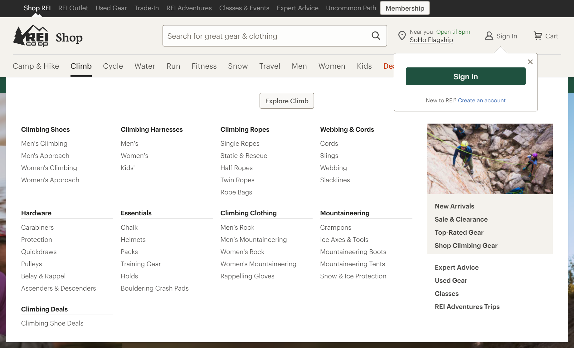
Ideal for sites with a lot of content, the drop-down menu features an interactive navigation set up that, as the name suggests, drops down or expands to show more info when users hover over it. Drop-down menus allow you to display your main and sub-categories with links to your most important pages.

2. Horizontal bar
A simple, horizontal navigation bar works well for many sites, especially if you don’t have a lot of content. With a clean, horizontal bar at the top of your site, you can easily direct visitors to key pages where they can learn more or convert.

3. Hamburger menu
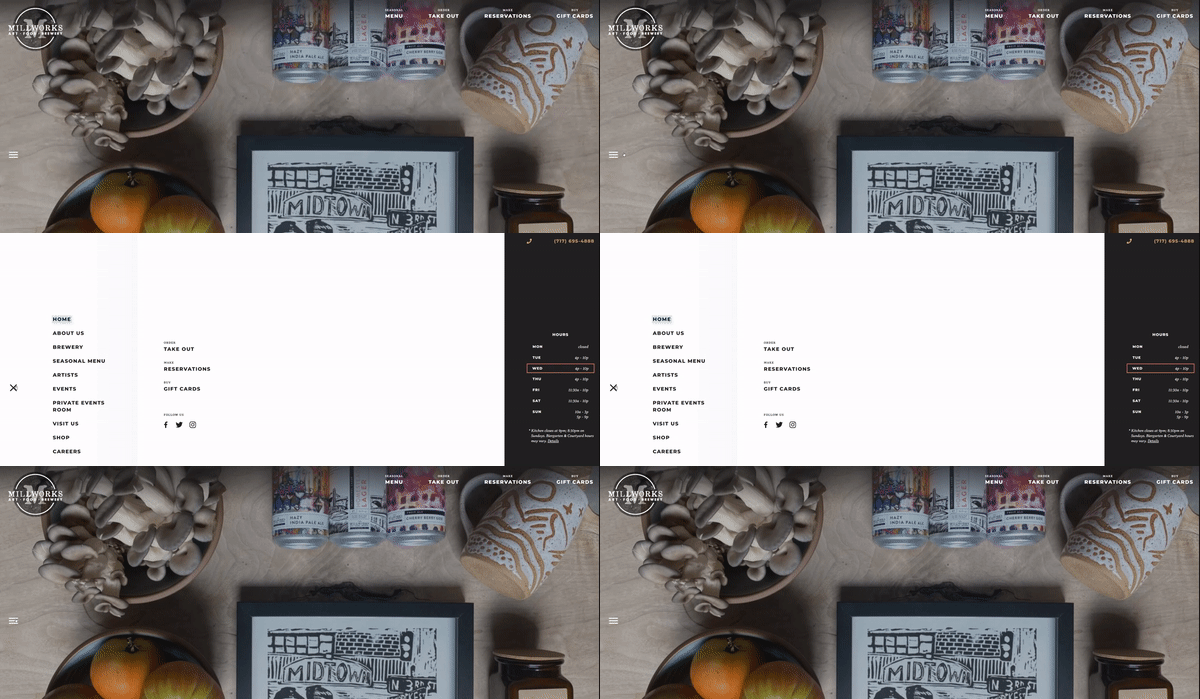
Hamburger menus, popular with mobile design, feature navigation links that collapse behind a hamburger button. When users click the hamburger button (three-line icon), the menu expands to display the navigation links.

4. Vertical sidebar
In contrast to a horizontal navigation bar, vertical sidebars stack navigation items on top of each other vertically in a site’s sidebar. Vertical sidebars work well for creative sites or in cases where you want to write longer navigation links.

No matter the type of navigation you choose, you’ll want to follow a few best practices.
Website navigation best practices
When designing your website, you might hear the phrase “don’t reinvent the wheel.” While it’s important to have a unique site design that identifies your website with your branding, there are certain best practices that all sites should follow.
As much as you may want to make a lasting impression by changing things up, the goal with any website navigation is for visitors to intuitively understand what they need to do to find what they want. Features like navigation menus with sub-categories can help users find more detailed information.
Because 94% of visitors’ first impression of your website relies on its design, having intuitive features can help build trust and credibility. Some website navigation best practices include:
- Consistency: Consistency in website navigation means that each page of your website follows a similar pattern or structure. You can easily confuse visitors if, for example, your menu is in a different spot on each page of your website.
- Accessibility: When making your website accessible, think about design features that work for everyone, such as text descriptions for images and keyboard functionality. Considering almost 97% of the top 1 million websites have Web Content Accessibility Guideline (WCAG) failures, accessibility features can put your website ahead of your competitors and provide more value for your visitors.
- Hierarchy: Be sure to prioritize linking to main and sub-category pages in your navigation, so users can clearly understand your site hierarchy and find the most important pages.
- Keyword-rich descriptions: You’ll want to use keyword-rich page descriptions in your navigation to support your search engine optimization (SEO) and UX strategies.
- CTA buttons: Another navigation best practice is to incorporate clear call to action (CTA) buttons so you can easily guide visitors to take the next step. Making these buttons stand out from the rest of the content on the page can increase conversions.
- Responsive design: People access websites on all different kinds of devices, including laptops, mobile phones, and tablets. Responsive design means your website functions on various devices, which can make or break your bounce rate in a world where people spend 70% of their Internet time on their mobile phones.
4 website navigation trends to improve UX
UX is one of the most important features of website design and navigation. However, that doesn’t mean every website has to — or should — look the same. Check out the four top website navigation design trends that can improve UX.
1. Creative scrolling
Since scrolling is one of the most intuitive actions for visitors on a website to take, some websites have incorporated creative scrolling. These features include animations and images as the user scrolls through the site. These websites are highly design-focused and work well for companies that want to project a high-end, creative persona.
Creative scrolling experiences can be as complex or simple as you want. Effective strategies include a range from simple black-and-white text and images or an assortment of colorful designs, images, and videos.
2. Typographic hero images
The hero image is the large, oversized banner at the top of a website. It is often the very first feature that catches the eye of your audience, so it can say a lot about your website and your brand. More websites are turning away from busy graphics and implementing typographic hero images.
With oversized fonts, typographic headers eliminate images and let the words speak for themselves. These hero images draw attention with their simplicity, and websites often use these to direct visitors to crucial links or use them as a call to action.
3. Interactive features
In addition to creative scrolling experiences, more websites incorporate interactive features that call on users to interact with the page as they navigate through their clicks, swipes, and mouse movements. Visitors might swipe through different images or be able to manipulate graphics by passing over them with their cursor.
These websites ask users to actively participate in their browsing, creating a more active audience — but it may be a gamble for some companies. The trick is to include features that are both engaging and easy-to-use.
4. DIY graphics
While having highly-stylized graphics, texts, and images is one website navigation trend, another trend gaining popularity takes the do-it-yourself (DIY) route. You can personalize your website and navigational features using handmade graphics and designs.
Websites with DIY graphics might use hand-drawn features to draw the eye or incorporate text that looks hand-written in the menu and other navigational tools. This style can make your brand persona more approachable and generally works best for businesses that hinge on relatability and personalization.
Discover the benefits of UX web design from WebFX
The expert strategists and designers at WebFX can help your business craft a site that’s primed for UX. Already have a website? Our world-class website redesign services will optimize your existing page to increase your leads and conversions.
From navigational features that target audience intent to on-page search engine optimization (SEO), we have the experience and skills to bring your website to the next level.
We’ve helped our clients generate over $3 billion in revenue in the last five years. Contact a strategist for a free quote today!
Google Maps SEO: 10 Tips to Rank Higher on Google Maps
What is Google Maps SEO? Google Maps SEO (search engine optimization) is the process of making your business visible on Google Maps when users search for related keywords to your business. As an internet user, you have likely done a Google search to find a local store selling the product you’re looking for near you. […]
Read moreHow To Check Google Ranking?
Learning how to check Google ranking lets you know how much exposure your website receives for specific keywords. Checking your website’s Google ranking may help you identify areas of strengths and weaknesses you can improve on to rank higher on the SERPs and boost your return on investment (ROI). Read on for more information about […]
Read moreWhat Is Google EEAT and How To Optimize Your Site?
Over the years, digital marketers have determined the key elements that produce a high-ranking webpage. But little is known about the Google algorithm that puts webpages at the top of the SERP. However, Google has provided helpful guidelines to ensure quality pages match user intent. Explore what Google EEAT is and what you can do […]
Read moreHow To Add Google Analytics to WordPress?
Google Analytics is one of the most efficient web analytics tools offered by Google for businesses and individuals who want statistics on a specific website’s performance. Further to this, it provides you as the site owner with data on visitor insights such as how they access the site, the channels they use, top keywords used to […]
Read more